Showing posts with label video. Show all posts

Jul 6, 2014

Ivan Sutherland on Research and Fun

The Computer History Museum had invited Ivan Sutherland to talk about Research and Fun for an evening in 2005. I was electrified to listen to his words when the recording was first published on research.sun.com – you know, we both worked at Sun those days. I even did a partial transcript of a key section where he offers the essence of what it takes being a good researcher, excerpt of the excerpt:
…if you would be a researcher it seams to me that you’d best search your soul first to find out what it is you like to do. … what ever it is make sure that you pick something to work on that you like, that you think is fun. Because if it isn’t fun you aren’t going to be very good at it. [more]
When Sun went down – this video went away. How odd that a museum depends on the fortune of a single company to preserve its assets. Hence this video was off-line for a couple of years until I offered to upload my backup version earlier this year. The Computer History Museum rejected my idea, but assured me to upload the video to the official CHM channel on YouTube. So thanks a lot to Sara Lott for republishing the talk!


Odysseys in Technology: Research and Fun, lecture by Ivan Sutherland on YouTube

Have fun! (And drop me a line when YouTube is switched off)

Mar 31, 2014

Window Cooling at Xerox Star

// reblogged via interaction-design.org on fb

So this morning I was curious about the origin of what is often referred to as the hamburger icon. Spent a few minutes digging around and found this video from the Xerox Star. Turns out that Norm Cox is who designed the interface for this system. I emailed Norm and asked who designed the hamburger icon? Here’s his response:

You've done your homework and found the right guy. I designed that symbol many years ago as a "container" for contextual menu choices. It would be somewhat equivalent to the context menu we use today when clicking over objects with the right mouse button.

Its graphic design was meant to be very "road sign" simple, functionally memorable, and mimic the look of the resulting displayed menu list. With so few pixels to work with, it had to be very distinct, yet simple. I think we only had 16x16 pixels to render the image. (or possibly 13x13... can't remember exactly).

Interesting inside joke... we used to tell potential users that the image was an "air vent" to keep the window cool. It usually got a chuckle, and made the mark much more memorable.

It's been nice to see that so many of our designs from those early pioneering years have stood the test of time and become ubiquitous symbols in our UI’s.

Feel free to share the short story. I have many more design related stories from my days at Xerox PARC during the birth of graphical UI's, and subsequent 30+ years consulting. I think it's important to share the past with designers today to help them understand the philosophies, constraints, considerations and inspirations that got us to where we are today. I only ask for proper attribution when you post something from me. (I like people to know that they can get in touch with me for more design tales!)

Kind regards

Norm

all-the-widgets from Brad Myers on Vimeo.

Mar 20, 2014

Deeper Cosmology - Deeper Documents

Ted Nelson 2013 - by Frode Hegland, animated by Matthias Mueller-Prove

This is not my planet. And this is not my conference.
– Ted Nelson’s opening words at ACM Hypertext 2001. Once in a while I find it very refreshing to remind myself on potential alternatives and fundamental considerations about the state of technology with respect to the web and our knowledge management tools as such. An ever-trusted source on this is Ted Nelson (bibliography and videos).
More quotes from the talk:
  • I think of the world wide web and XML and cascading style sheets is the ultimate triumph of the typesetter over the author.
  • three fundamental problems today:
    1. hierarchical file structures
    2. simulation of paper
    3. the application prison
  • Software is a branch of movie making.
  • The question is about starting over.
A friend who has attended the conference gave me a CD with the talk. Eventually, I decided to upload the recording to vimeo. Please enjoy:


Ted Nelson at ACM Hypertext 2001 from mprove.

Photo: Ted Nelson 2013 - by Frode Hegland, animated by myself

Mar 14, 2014

Starfire

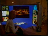
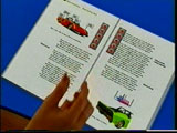
The second video – which I helped to put into the public space – is also from the vision'n'concept department: Starfire by Sun Microsystems 1994.


At CHI ’98 I've attended a presentation by Frank Ludolph on Apple Lisa. Frank had also booth duty at the conference where he spread a couple of VHS tapes of Starfire. What marvelous concepts! Multitouch, voice UI, wall-size displays, tablets with motion and orientation sensors, telepresence for video conferences, among many more...
Years later – in 2005 – I asked Tog for a digital copy. Of course he had one – but no permission for sharing. By chance I was working for Sun at the time and got approval from Sun's VP Juan Carlos Soto to release the video. So please enjoy_


Starfire Director's Cut, Sun 1994

More References

Mar 11, 2014

Future Shock

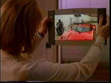
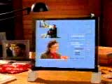
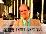
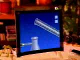
There are a couple videos in the public domain space now where I take credit to have preserved them from fading away. The first is Future Shock by Apple 1988.
Future Shock: gesturesFuture Shock: gesturesFuture Shock: glasses with subtitlesFuture Shock: e-learning

I saw it first on an Apple promo CD while working at BBDO in the early 1990s. It was a tiny QuickTime movie. But it made a huge impression on me. Gesture and voice interaction, as well as an early predecessor concept of google glass – didn't know that at the time ;)

A decade later I stumbled upon the CD at the library of the IZHD, made a backup copy, and uploaded it to my site. From there it went to Mac Essentials' magazine site, and eventually to youtube.

The poor quality is still due to the original QT version. I would be very interested to get a hires version...


Future Shock, Apple 1988 from mprove.

Jan 26, 2013

Jan 21, 2013

12 Lessons by Jobs/Kawasaki

12 Lessons Steve Jobs Taught Guy Kawasaki


  1. Experts are clueless.
  2. Customers cannot tell you what they need.
  3. Biggest challenges beget the best work.
  4. Design counts.
  5. Big graphics.
    Big Fonts.
  6. Jump curves, not better sameness.
  7. "Work" or "doesn’t work" is all that matters.
  8. "Value" is different from "price".
  9. A players hire A players.
  10. Real CEOs do demos.
  11. Real entrepreneurs ship.
  12. Some things need to be believed to be seen.

Dec 5, 2011

You can influence life


Everything around you that you call life was made up by people that were no smarter than you. And you can change it. You can influence it. You can build your own things that other people can use. Once you learn that you will never be the same again. - Steve Jobs

Nov 21, 2011

NeXT startup retreats

20 minutes on the initial retreats of NeXT Computer...

Apr 26, 2011

Bill Buxton (2008): Design Thinking in the Wild

Bill Buxton at the 2008 Institute of Design Strategy Conference: Design Thinking in the Wild


Design Thinking in the Wild from mprove on Vimeo.
Bill Buxton at Institute of Design Strategy Conference, 2008

Republished with friendly permission by Bill.

a pròpos

Apr 25, 2011

Managing User Experience - Managing Change

"Managing User Experience... Managing Change", a panel session at CHI 2010 with the UX Directors Irene Au (Google), Catherine Courage(Citrix), Nida Zada (Plaxo/Comcast), and Arnie Lund(Microsoft), moderated by Carola Thompson (mindjet).

resonance design strategy

Continuum Resonance Video: Getting to the right idea from Continuum on Vimeo.

(via UXForum@xing)

Apr 2, 2011

Bill Verplank at Interaction 11


Bill Verplank: Opening Keynote from Interaction Design Association.
"Bill Verplank is a human-factors engineer with a long career in design, research and education. As a fresh ME PhD from MIT he worked eight years at Xerox on the testing and refinement of what we now call the "desktop metaphor": bit-map graphics, keyboard and mouse, direct manipulation. For six years, he worked with Bill Moggridge at IDTwo and IDEO doing "interaction design" - bringing the insights from computers to the industrial design of medical instruments, GPS navigation, mobile phones, and new input devices (keyboards, track-balls, mice). From IDEO, he moved to Interval Research for 8 years of innovating design methods (observation, body-storming, scenarios, metaphors) and researching active force-feedback ("haptics").

He began teaching design and man-machine-systems as a graduate student at MIT and "visual thinking" and product design at Stanford in the '70s. Since then he has lectured regularly in human factors, user-interface design and most recently "new music controllers" at Stanford's CCRMA. In 2000, he joined the steering committee of the Interaction Design Institute Ivrea (IDII) in Italy and has consulted most recently with the Copenhagen Institute of Interaction Design (CIID). He co-authored ACM SIGCHI Curriculum Recommendations and, for seven years, taught popular tutorials on Graphical Interface Design and Sketching Scenarios. He is known for sketching as he talks."
See also_ Bill Verplank sketches metaphors at BayCHI 2008

Jun 24, 2010

Kars on Transmutation

Kars Alfrink presented at Raum Schiff Erde in February 2010.

His talk on Transmutation is now online.

The talk’s title refers to alchemists’ quest to turn lead into gold, which sometimes feels similar to what we’re trying to do with pervasive games in public urban places.1 To summarize: I start by talking about the fact that games are essentially useless, and that this means applied game design should look for useful results in second order effects. I argue that the contribution of urban games lies primarily in the increased diversity of use of our streets, which is a good thing in itself. I talk about the care designers need to take with the games they deploy, since not everyone is looking to play and we should respect that. Playing games is a voluntary thing by definition. Towards the end I go into different strategies for using games to increase systemic awareness using several games as examples. I wrap up with a look at reward systems we commonly find in games like Foursquare, which now serves as templates for a lot of work in this area. I feel that this leads people away from what game design is about in the first place: creating interesting activities.

Jun 11, 2010

focus groups for innovation

If a focus group of cavemen had to decide on a proposal called wheel...


(via celebrating 10 yrs SirValUse)

Jan 13, 2010

Ivan Sutherland on Leadership

ivan_sutherland480.jpg
Ivan talked about leadership at Sun's SEED summit 2006. The remarkable event has been captured on tape and is now online.

May 14, 2009

PaperPoint

Beat Signer on PowerPoint Multimedia Presentations in Computer Science Education: What Do Users Need? /30' video at TU Graz

Structured interviews with 9 faculty members of ETH Zurich lead to the following desired features

  • Highlighting and annotating slide content
  • Use blank "sheets"
  • Use video controls
  • Use system mobile
  • Orientate efficiently within slide collection
  • See content of current and nearby slides

Idea for PaperPoint: Use Anoto pen on hand-out of presentation to control the slide show. Very nice!

Publication: PaperPoint: a paper-based presentation and interactive paper prototyping tool. In: Tangible and embedded interaction. Proceedings of the 1st international conference on Tangible and embedded interaction

Mar 28, 2009

SpatialKey

Feb 28, 2009

Information Architecture TV

Jan Jursa colected more than 300 presentations and clips over the last 2 years. Bring some time to watch the show...