Oct 1, 2014

Von Schaltern und Einhörnern


Meine Eingangsfrage ans Publikum der Mediale war, was denn ihre erste Erinnerung im Umgang mit Technik sei. Es hat erstaunlich lange gedauert – Gameboy, DVD-Player und Radio waren die ersten Antworten – bis der von mir ersehnte Lichtschalter genannt wurde. Und dann endlich konnte ich meine Salve von Schaltern, Tastern und Buttons abgeben, um die Berufsschüler für die Sichtweise der User Experience zu sensibilisieren.
Die beiden Bilder mit den Radfahrern in Kopenhagen muss ich erklären (Folie 13 und 14). Der erste Radler in dunkelblau gibt ein Handzeichen. Nein, wir kennen uns nicht und er winkt mir auch nicht zu. Er gibt ein Signal an die Radler hinter ihm, dass er gleich abbremsen wird und ihm bitte doch niemand auffahren möge. Und das macht nicht nur einer – das machen alle Radfahrer in Kopenhagen! Anhand dieses Beispiels kann man wunderbar über Gesten und Konventionen diskutieren.
Die schöne Schlussformulierung…
Interaction Designer sind spezialisiert darauf, Produkte und Dienstleistungen verständlicher zu machen, um damit die Kundenzufriedenheit und Kundenbindung zu erhöhen.
…habe ich mir von Christian Reichel geborgt.


Sep 25, 2014

WUD Engagement


Es ist an der Zeit sich für den World Usability Day am 13. November 2014 zu engagieren. Die Vorbereitungen haben in vielen Städten – national und international – bereits begonnen. Und auch Hamburg ist zum neunten mal mit von der Partie.
Den Hamburger Call for Participation für Vorträge und Workshops habe ich auf uxHH veröffentlicht. Bitte schert Euch nicht um die Deadline. Da ist immer noch Luft.
[Update] Neue Deadline für engagierte Vorschläge: Freitag, 26.9.
[Update] Das Programm ist da.

Sep 7, 2014

UX Logbuch


Seit heute bietet das UX Logbuch eine Übersicht der neuesten Blogartikel aus der deutschen und deutschsprachigen UX-Szene. Lass von Dir hören, wenn ich Deinen Blog rund um die Themen User Experience / Usability / Interaction Design / Service Design / Design Thinking / etc. mit aufnehmen soll.
Viel Spass beim regelmäßigen Lesen des UX Logbuch.

Aug 1, 2014

UXCampHH - 16-Aug-2014

UXCamp Hamburg 16-Aug-2014
Save the Date - UX Camp Hamburg will take place again on Saturday, August 16 at SinnerSchrader in Hamburg.

Stay up to date by joining our newsletter: http://uxcamphh.org
Or follow us on twitter: @uxcamphh
Official Hashtag: #uxcamphh

Kati, Martin & Matthias
Your UX Camp Hamburg team

[Update] The second lot of 50 tickets will be on sale on Saturday, Aug-2 at 1pm.

Jul 6, 2014

Ivan Sutherland on Research and Fun

The Computer History Museum had invited Ivan Sutherland to talk about Research and Fun for an evening in 2005. I was electrified to listen to his words when the recording was first published on research.sun.com – you know, we both worked at Sun those days. I even did a partial transcript of a key section where he offers the essence of what it takes being a good researcher, excerpt of the excerpt:
…if you would be a researcher it seams to me that you’d best search your soul first to find out what it is you like to do. … what ever it is make sure that you pick something to work on that you like, that you think is fun. Because if it isn’t fun you aren’t going to be very good at it. [more]
When Sun went down – this video went away. How odd that a museum depends on the fortune of a single company to preserve its assets. Hence this video was off-line for a couple of years until I offered to upload my backup version earlier this year. The Computer History Museum rejected my idea, but assured me to upload the video to the official CHM channel on YouTube. So thanks a lot to Sara Lott for republishing the talk!


Odysseys in Technology: Research and Fun, lecture by Ivan Sutherland on YouTube

Have fun! (And drop me a line when YouTube is switched off)

May 18, 2014

fotokartierungsmischmasch


Neulich kam in einer fb-Gruppe die Frage auf, ob man die Fotos der Mitglieder aus der Region Rotenburg schön und einfach auf eine Karte stellen könnte.
Für diesen Blog hier nun die leicht überarbeitete Fassung meiner Antwort:

Ich werde mich hüten eine Kartenlösung vorzuschlagen, die dann aus diversen Gründen nicht funktionieren wird. Und die Gründe sind sowohl gestalterischer Natur (Design, Usability, Aufgabenangemessenheit, Praktikabilität), als auch dieser (jeder) etablierten Community geschuldet.
Jüngst habe ich mit google maps experimentiert und für einige meiner Photo-Serien einen guten Weg gefunden. Schon mit ein paar Änderungen in den Settings treten die Marker und Pfade in der Vordergrund und die Karte sieht nicht mehr wie eine typische Google-Map aus. (Erweitert man aber die Geodaten um nur eine Marke in Berlin, schaut die Karte in der default Zoom-Stufe nicht mehr zufrieden stellend aus: Hamburg verschwindet fast unter der Legende oben links und The-Middle-of-Nowhere rückt ins Zentrum der Karte. Nicht gut.)

Die Karte zu Sven Klomps partizipativen Events unter dem Titel aufmerksam haben wir gar gemeinsam bearbeitet.  Das geht, aber alle Kuratoren müssen sich mit dem Kartieren auskennen und es war nicht ganz einfach die Medien von verschiedenen Plattformen einzubinden. Für aufmerksam haben wir Bilder von flickr, 23hq, google+; youtube-Videos (vimeo war nicht direkt zu verwenden); und Soundtracks von soundcloud eingebunden. Alleine die Bilder waren kniffelig genug, da flickr und g+ per se keine öffentlichen URLs herausreichen. Per Context-Menu-Copy-Link vom Bild bekommt man dann einen direkten Deep-Link, der dann doch funktioniert. Der tumblr Blog ist schließlich die gut lesbare Klammer, der all die persönlichen Eindrücke des Abends zusammen hält. [cf. the verge: tumblr profiles that do not look like anybody's else]

Zwischenfazit: bei einigermaßen übersichtlichem Bilder- und Multimediadatenlage kann man mit vertretbarem Aufwand interessante Layer auf Basis von google maps anlegen.

Bei wachsender Heterogenität des Materials wird es allerdings zunehmend aufwendig. Ganz gleich ob man sich für google maps oder beispielsweise OpenStreetMap entscheidet: je mehr Quellen man einbinden möchte, desto komplexer die Aufgabe des  Zusammenführens der Informationen.
Bei der Kartenkuratorin kann das schnell zu Frust führen, da sie doch schon freiwillig(!) die Karte administriert, dann aber von den anderen Photographen keine Bilder mehr geliefert bekommt oder der Kommunikationsaufwand sehr groß wird die Fotoserien auf den korrekten Ort der Karte zu platzieren.

Ja, es gibt auch technische Ansätze, mit denen man Photos und Blogbeiträge automatisch auf Karten erscheinen lassen kann. Geotagging in den Metainfos der Bilder und Geotags in den Blogbeiträgen erlauben es beispielsweise diese auf einer OpenStreetMap einzublenden (z.B. cupofcoffee)
Der technische Aufwand ist da aber sehr viel größer als bei einer manuell gepflegten Karte und man ist auch sehr eingeschränkt bzgl. der Ausgangsdaten. (Im Beispiel ist das ein WordPress-Blog mit dem installierten und konfigurierten OSM-Modul.)

Es scheint in heutiger Zeit – dem sogenannten Informationzeitalter – etwas zu verwundern, wie spröde es ist ein Meshup aus diversen Quellen zusammen zu stellen [cf. info plumbing]. Die Heterogenität der Multimediadaten, die unterschiedlich bis gar nicht ge-geo-taggt sind, und der Silo-Charakter der Social Networks steht dem leider entgegen. [cf. 
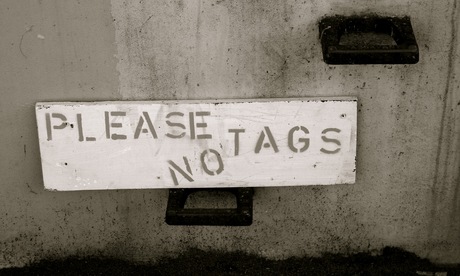
Tagging – ein sozialer Tag-Traum?]
Von einer Vision àlas "ein sich drehender Globus mit Polaroids, in die man einfach mal so einzoomen kann" bleibt uns einstweilen nur zu träumen.

Oder übersehe ich etwas? Wer kennt eine cross-platform Kartierungslösung für heterogene schwach-getaggte Multimediadaten, die auch noch gut zu gestalten ist?

Weitere inspirierende Beispiele:
Und Tools

Mar 31, 2014

Window Cooling at Xerox Star

// reblogged via interaction-design.org on fb

So this morning I was curious about the origin of what is often referred to as the hamburger icon. Spent a few minutes digging around and found this video from the Xerox Star. Turns out that Norm Cox is who designed the interface for this system. I emailed Norm and asked who designed the hamburger icon? Here’s his response:

You've done your homework and found the right guy. I designed that symbol many years ago as a "container" for contextual menu choices. It would be somewhat equivalent to the context menu we use today when clicking over objects with the right mouse button.

Its graphic design was meant to be very "road sign" simple, functionally memorable, and mimic the look of the resulting displayed menu list. With so few pixels to work with, it had to be very distinct, yet simple. I think we only had 16x16 pixels to render the image. (or possibly 13x13... can't remember exactly).

Interesting inside joke... we used to tell potential users that the image was an "air vent" to keep the window cool. It usually got a chuckle, and made the mark much more memorable.

It's been nice to see that so many of our designs from those early pioneering years have stood the test of time and become ubiquitous symbols in our UI’s.

Feel free to share the short story. I have many more design related stories from my days at Xerox PARC during the birth of graphical UI's, and subsequent 30+ years consulting. I think it's important to share the past with designers today to help them understand the philosophies, constraints, considerations and inspirations that got us to where we are today. I only ask for proper attribution when you post something from me. (I like people to know that they can get in touch with me for more design tales!)

Kind regards

Norm

all-the-widgets from Brad Myers on Vimeo.

Mar 20, 2014

Deeper Cosmology - Deeper Documents

Ted Nelson 2013 - by Frode Hegland, animated by Matthias Mueller-Prove

This is not my planet. And this is not my conference.
– Ted Nelson’s opening words at ACM Hypertext 2001. Once in a while I find it very refreshing to remind myself on potential alternatives and fundamental considerations about the state of technology with respect to the web and our knowledge management tools as such. An ever-trusted source on this is Ted Nelson (bibliography and videos).
More quotes from the talk:
  • I think of the world wide web and XML and cascading style sheets is the ultimate triumph of the typesetter over the author.
  • three fundamental problems today:
    1. hierarchical file structures
    2. simulation of paper
    3. the application prison
  • Software is a branch of movie making.
  • The question is about starting over.
A friend who has attended the conference gave me a CD with the talk. Eventually, I decided to upload the recording to vimeo. Please enjoy:


Ted Nelson at ACM Hypertext 2001 from mprove.

Photo: Ted Nelson 2013 - by Frode Hegland, animated by myself

Mar 14, 2014

Starfire

The second video – which I helped to put into the public space – is also from the vision'n'concept department: Starfire by Sun Microsystems 1994.


At CHI ’98 I've attended a presentation by Frank Ludolph on Apple Lisa. Frank had also booth duty at the conference where he spread a couple of VHS tapes of Starfire. What marvelous concepts! Multitouch, voice UI, wall-size displays, tablets with motion and orientation sensors, telepresence for video conferences, among many more...
Years later – in 2005 – I asked Tog for a digital copy. Of course he had one – but no permission for sharing. By chance I was working for Sun at the time and got approval from Sun's VP Juan Carlos Soto to release the video. So please enjoy_


Starfire Director's Cut, Sun 1994

More References

Mar 11, 2014

Future Shock

There are a couple videos in the public domain space now where I take credit to have preserved them from fading away. The first is Future Shock by Apple 1988.
Future Shock: gesturesFuture Shock: gesturesFuture Shock: glasses with subtitlesFuture Shock: e-learning

I saw it first on an Apple promo CD while working at BBDO in the early 1990s. It was a tiny QuickTime movie. But it made a huge impression on me. Gesture and voice interaction, as well as an early predecessor concept of google glass – didn't know that at the time ;)

A decade later I stumbled upon the CD at the library of the IZHD, made a backup copy, and uploaded it to my site. From there it went to Mac Essentials' magazine site, and eventually to youtube.

The poor quality is still due to the original QT version. I would be very interested to get a hires version...


Future Shock, Apple 1988 from mprove.

Feb 14, 2014

uxHH facelift

I was in the mood to update the design of uxHH.de

See the two screenshots before and after to get an idea of the changes; i.e. new and larger fonts improve the legibility and character of the site, more white space for a better balance between text and background and a less "bloggy" appearance.


enjoy
-Matthias

Jan 11, 2014

Arrow Key Navigation


I was curious to figure out how e.g. flickr or facebook have implemented the behavior to move to the next image by simply pressing the right arrow key. Well, I do not really know down to the bleeding fingers, but here is my solution to move to the next page in a sequence of pages:

The mediathek of the Raum Schiff Erde offers a chronological tour for all sessions ever. The link to proceed to the next page in sequence has the attribute rel="next".

Then the head section needs a short jQuery/JavaScript to catch the right arrow key w/o the Ctrl/Cmd modifier pressed, identify the first link with the relation 'next' and trigger the link:
$(document).keydown(function(e) {
  var arrow = {left: 37, up: 38, right: 39, down: 40 };
  switch(e.which) {
    case arrow.right:
      if (e.metaKey) {return;}
      document.location.href = $("a[rel='next']")[0].href;
      break;
    default: return;
    }
  e.preventDefault();
  });

Have a look at the source code of the example above how to include the jQuery library.

I want to finish this little tutorial by mentioning that I did not invent the link relationships ('next' and 'prev') – but usually browsers do not make any use of this kind of semantic information. Heck, why not?! It would be cool if all web pagination would support this semantic behavior. Amen.

PS: A few more examples where I have applied the script:
// Photo cc by Craig